
Comparing Warm, Cool and Neutral Paint Colors at Home
Use fixed finishes and a small group of physical samples to choose the color relationships you prefer.
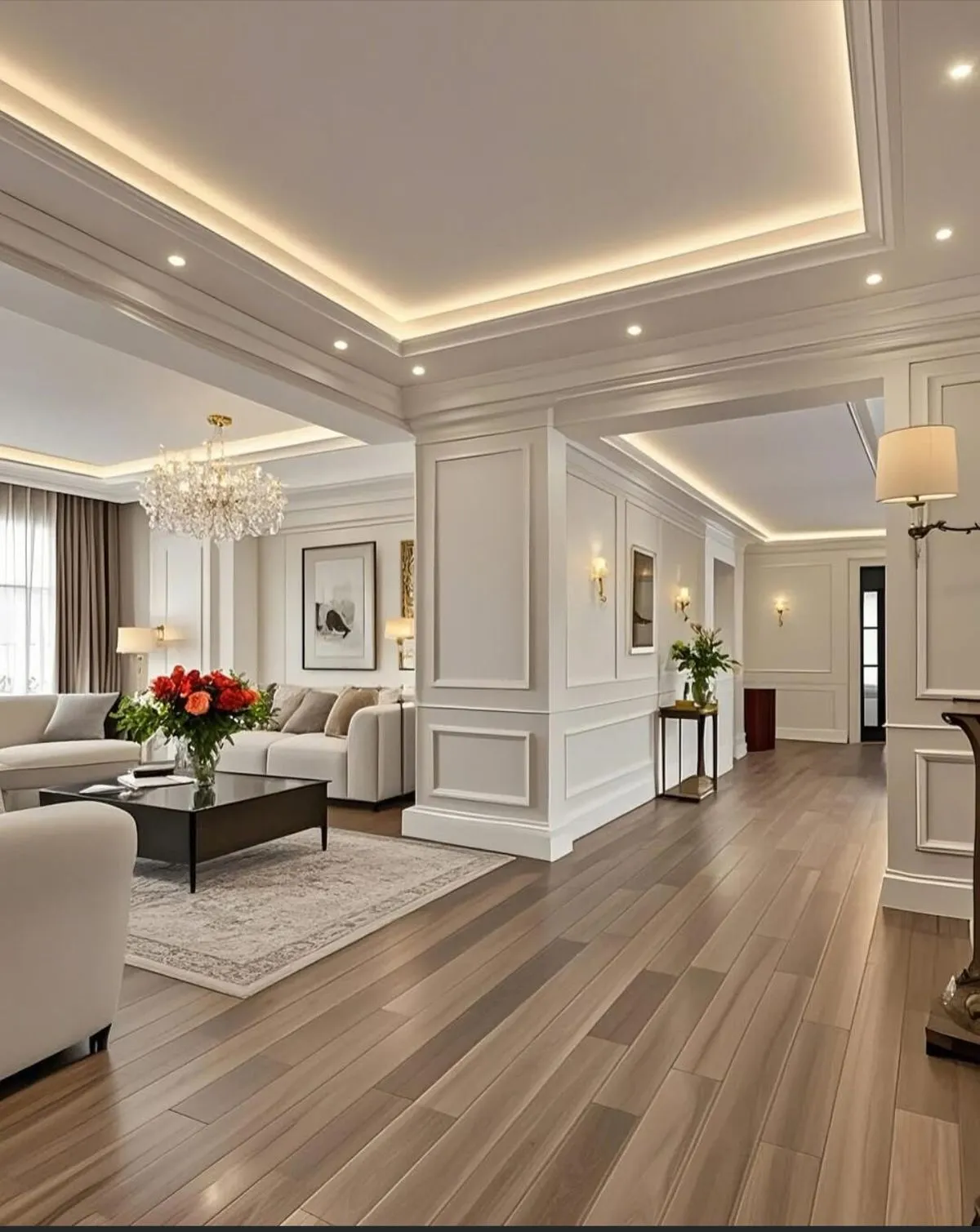
A neutral paint color can seem straightforward until it is placed beside the floor, trim or countertop. One sample may look pink next to a tile, while another appears gray beside the same surface. Rather than trying to solve the palette from a color name, use a few comparisons in the actual room.
“Warm,” “cool” and “neutral” can help organize a short list. They are starting descriptions, not instructions that force every surface into a single category. The goal is to choose relationships you like in the home you have.
Begin with the finishes that stay
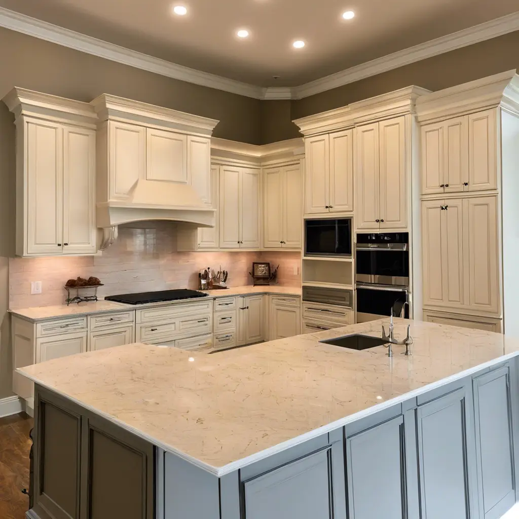
List the floor, cabinetry, stone, tile, metal finishes and major furnishings that will remain. Identify the two or three that matter most visually. A room with a prominent patterned counter asks a different color question from a room dominated by a wood floor.
Place paint samples near those finishes rather than viewing them against an unrelated surface. Compare the trim at the same time, especially when it will remain unchanged. Record what you notice without trying to give every material a technical label.
Give each sample a reason to be there
Choose a small set with purposeful differences. One might relate closely to the existing floor; another might offer a cooler contrast; a third might be lighter while keeping a similar character. A short list is easier to compare than a wall covered with unrelated choices.
Label each sample and keep its color identification. If you like one only in a particular spot, note what is beside it. That observation is more useful than deciding that a color is universally good or bad.
Build a neutral palette with clear roles
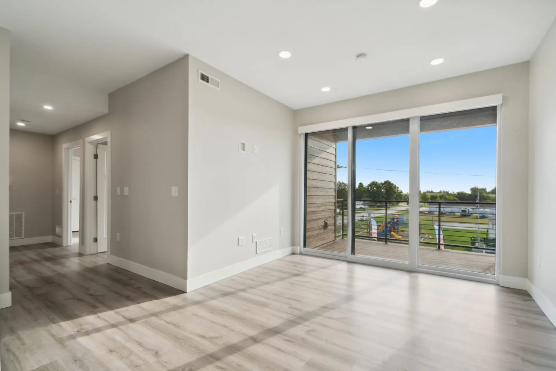
A neutral scheme can still contain meaningful differences between the walls, ceiling, trim and doors. Decide where you want a quiet transition and where you want the edges to read more clearly.
Compare those colors together. If a darker built-in or cabinet will remain, include it in the view. Keep the number of deliberate relationships manageable so each color has a purpose.
Neutral colors do not have to be identical across the home. Adjacent rooms can use related choices, provided the actual doorway views and transitions work for you.
Repeat the comparison under normal lighting
Look at the samples during the parts of the day when you use the room and again with the evening lights on. Include any planned lighting changes before making the final selection.
Consider the sample's finish as well as its color. Ask whether it represents the proposed wall product and sheen. A chip narrows the color choice; a representative physical sample helps confirm the appearance in place.
Record the decision by room and surface
Write down the approved color, sheen and stopping point for each surface. Keep a photograph as a reminder, while retaining the physical identification that the photograph cannot replace.
Bring the selected samples and room list to Henry's interior-painting service. The finished palette should connect your preference with the existing materials, the room's light and a clearly described painting scope.
Explore more of our work