
Storefront Finish Notes: Glass, Solid Walls and the Entrance Edge
Three commercial entrances place contrast around glass, fascia, masonry and taller corner features. The photographs provide practical ways to describe the surfaces in an exterior painting brief.
A commercial exterior is often viewed at an angle, with the entrance, side wall and roof edge visible together. That wider view can explain why a small strip of trim feels prominent on one building while a broad wall is the dominant surface on another.
Three photographs from Henry’s collection show different arrangements of glass, solid walls and darker edges. They are separate buildings with separate forms. The comparison is about what is visible and how those parts fit together, rather than an assumed painting scope for every surface in the frame.
A corner defined by glazing and a vertical feature
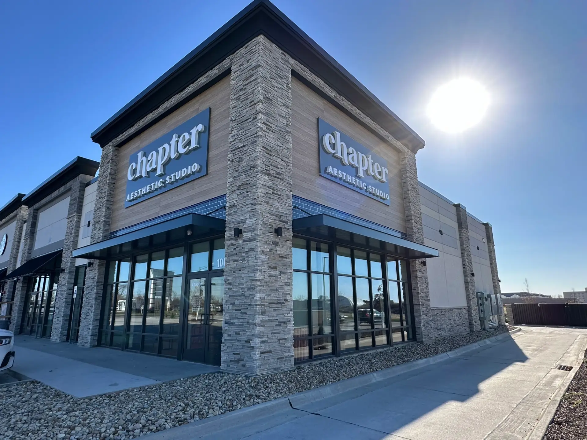
The lead photograph shows a corner storefront with tall dark-framed glazing, a stone-faced vertical feature and a dark band near the top. Glass occupies much of the ground-level view. The vertical feature marks the corner, while the upper band connects the front and side elevations.
Because the glazing is divided into repeated rectangles, the narrow framing has a strong presence even though the glass occupies more area. The stone adds a different texture beside those straight lines. A proposed painted wall or trim area would be viewed alongside both.
For a photo brief, capture the corner and the entrance in the same view. A straight-on image of only one wall would miss how the top band and framing continue around the building.
Dark fascia frames a glazed entrance
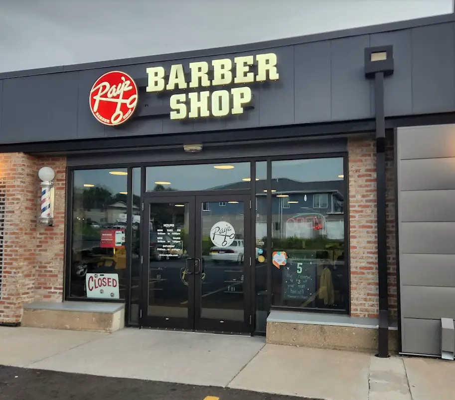
The second photograph shows a barbershop entrance between brick piers. A broad dark fascia carries the sign above the doors, while dark window frames continue the same visual edge around the glazing. The brick and lighter base remain separate parts of the composition.
This is a useful view for discussing how a sign band, door frames and adjoining masonry relate. It does not establish that every visible surface is part of a painting scope. Include those fixed materials in your reference photographs so the proposed finish can be considered alongside them.
A taller corner connects the front and side
The third photograph shows a dental-office storefront with repeated brick piers, gray upper wall panels and dark-framed glazing. A taller entrance feature stands at the corner, and dark canopies form horizontal lines above the windows. The side elevation continues the material palette while changing the balance of wall and glass.
A corner view shows those relationships more clearly than a single entrance close-up. Photograph both the approach and the side of your property when the proposed work includes more than one elevation.

Identify the edges you want to discuss
A useful exterior brief can name the wall fields, fascia, trim, doors and other specific painted areas proposed for review. Include the existing glazing, masonry, awnings and signage in the photographs so their relationship is visible. Describe where you prefer a continuous edge and where you want a distinct feature to remain prominent.
Explore HPC’s commercial-painting service and start with the actual elevations and entrance views of your property. A specific visual reference gives that conversation a clear subject.
Explore more of our work